The best breakfast tacos in Austin hands down
The best breakfast tacos in Austin hands down
Creative direction: Drew Lyon
Project manager: Travis McAshan
Lead designer: Marian Brchan
What We Did
Anyone who’s lived in or visited Austin has probably fallen in love with tacos, especially tacos for breakfast. That might explain why our team was so excited to start this project. We knew the food was great, but we were also blown away by how much emphasis they put on creating camaraderie among their team and community in their restaurants. They epitomize the noble local business mindset.
Post Launch Results
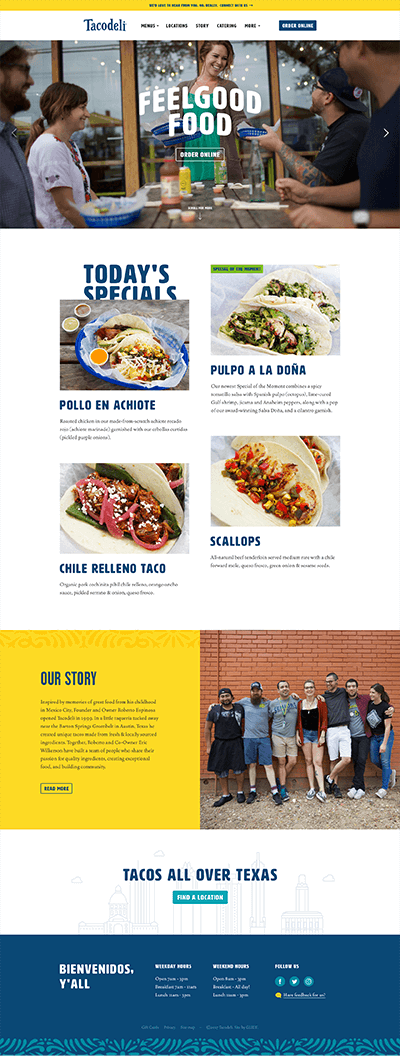

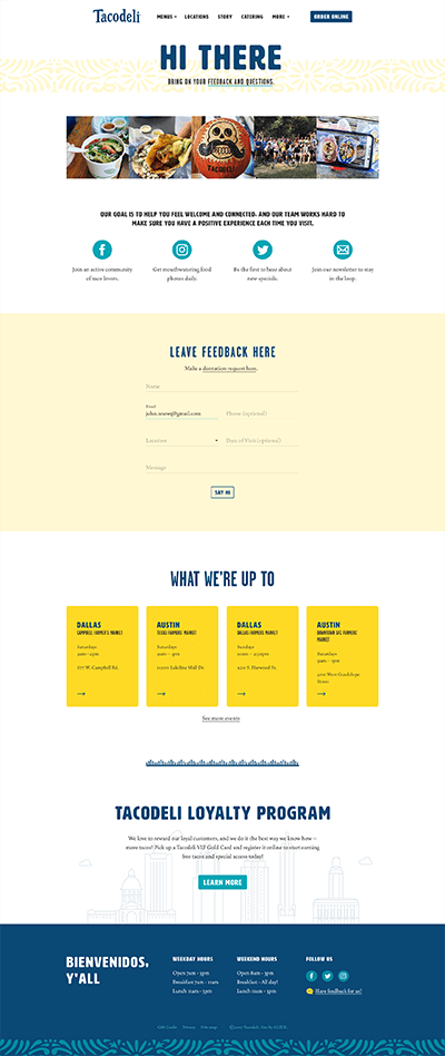
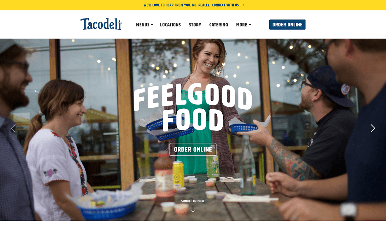
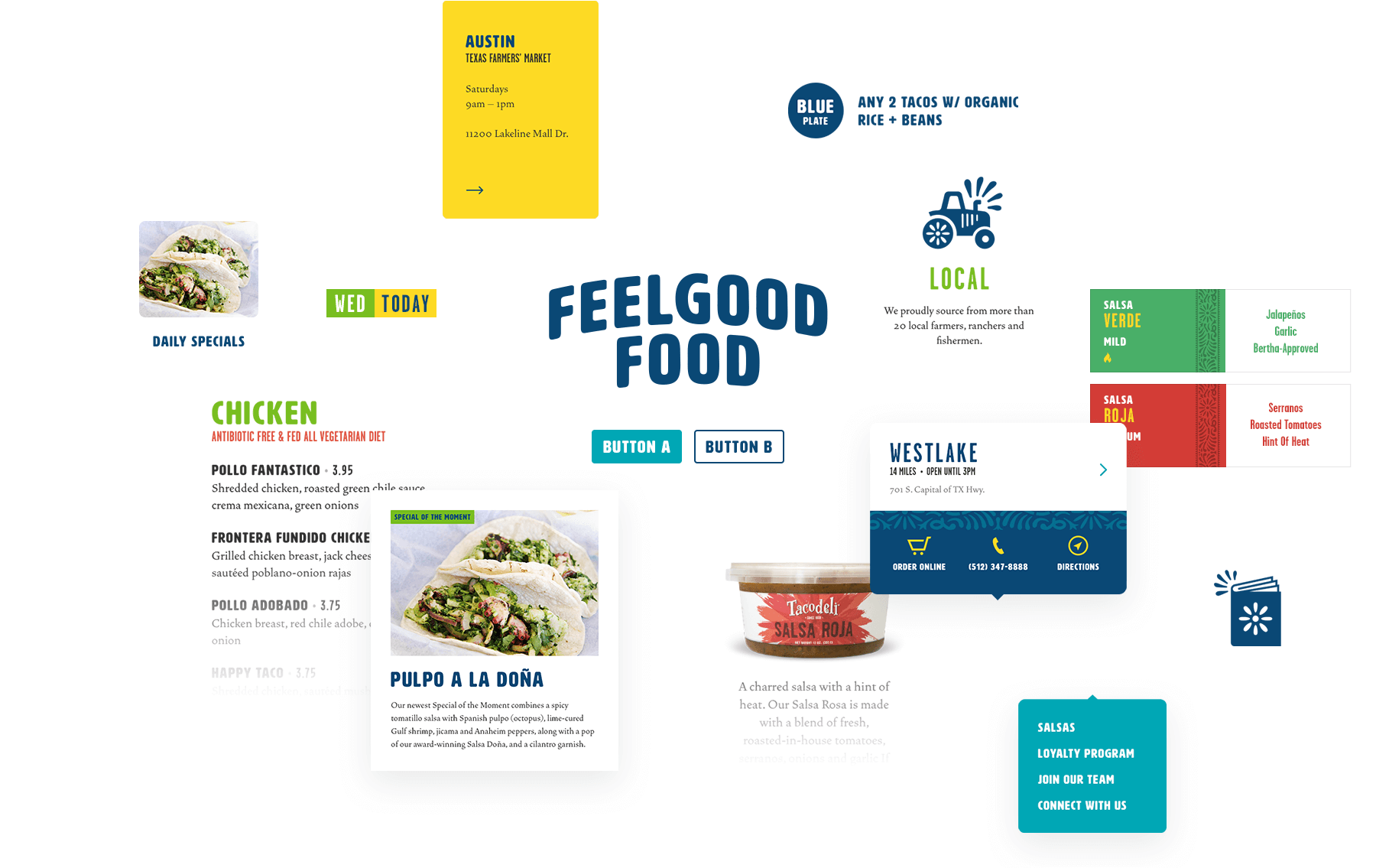
Website wise, there were a few big requirements. First, we had to capture the feel-good communal vibe described above. To do this we heavily featured photography of happy employees and customers enjoying themselves at Tacodeli locations. We also used bright colors and playful graphics to keep visitors browsing for more.
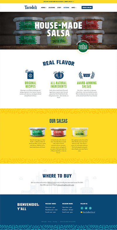
Second, Tacodeli was in the final stages of a complete visual re-brand when we started the project. That mean we had make sure there was continuity between the new look locations and the new website. It’s great for us when we have such a thoughtful brand guide to draw inspiration from when doing a redesign, so that informed all sorts of visual flourishes you see throughout the site.
What we learned
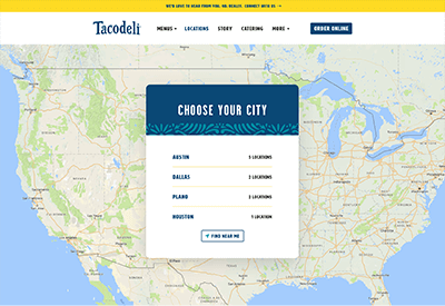
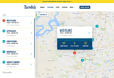
Finally, the most technically challenging part of the project was the Location Finder portion of the site. Rolling up our sleeves on the user experience side of things led to a lively dialogue, prototyping, lots of testing, tweaking, and retesting, before finally landing on a flow everyone was happy with.
