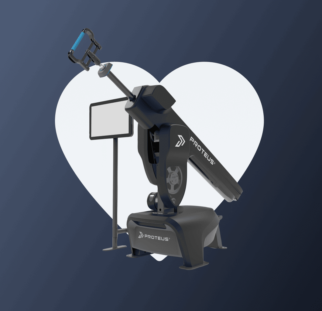
A game changer for physical training
and performance
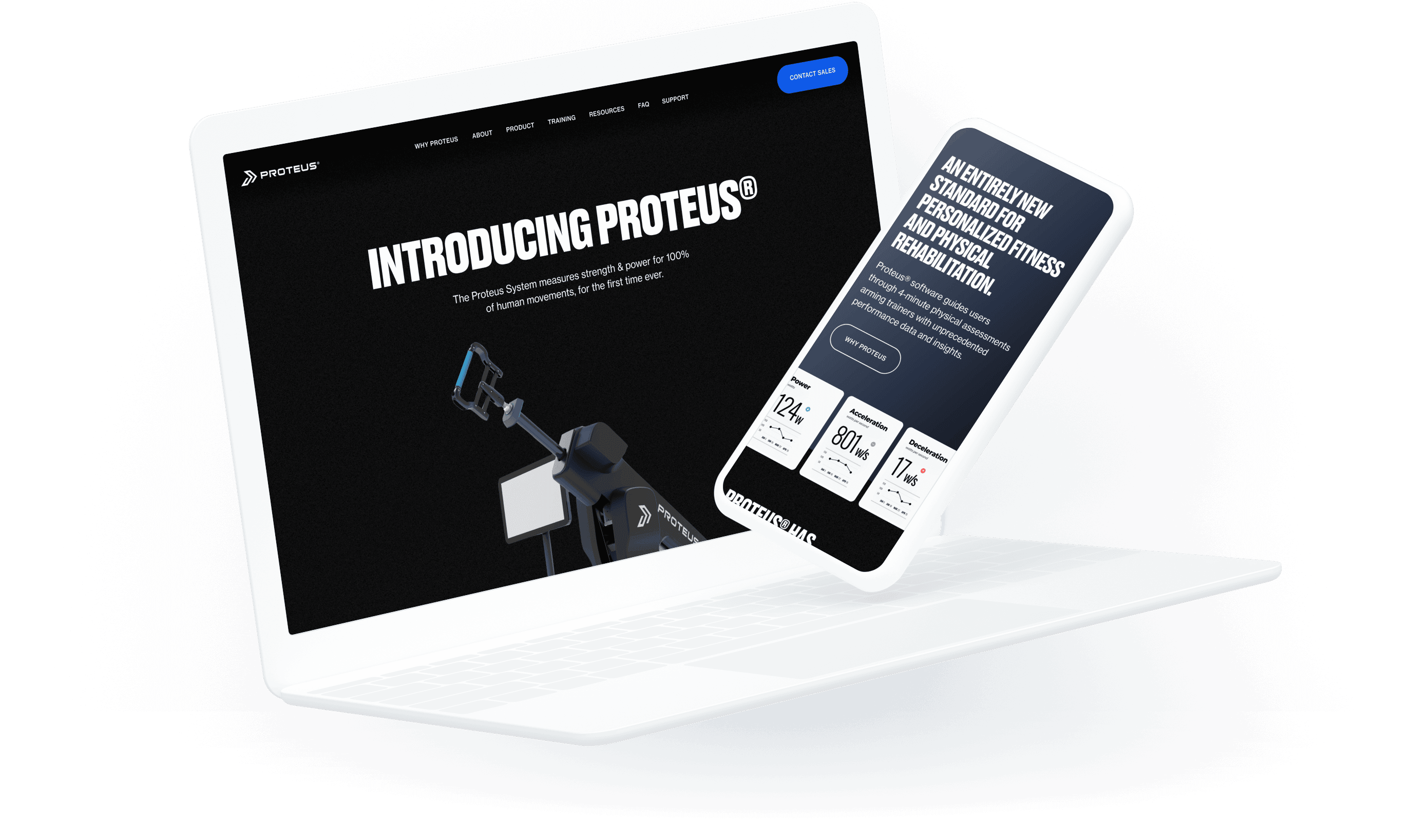
A game changer for physical training
and performance
Creative direction: Drew Lyon
Project manager: Kimberly Yount
Content strategist: Jessica McDaniel
Lead designer: Jakub Reis
What We Did
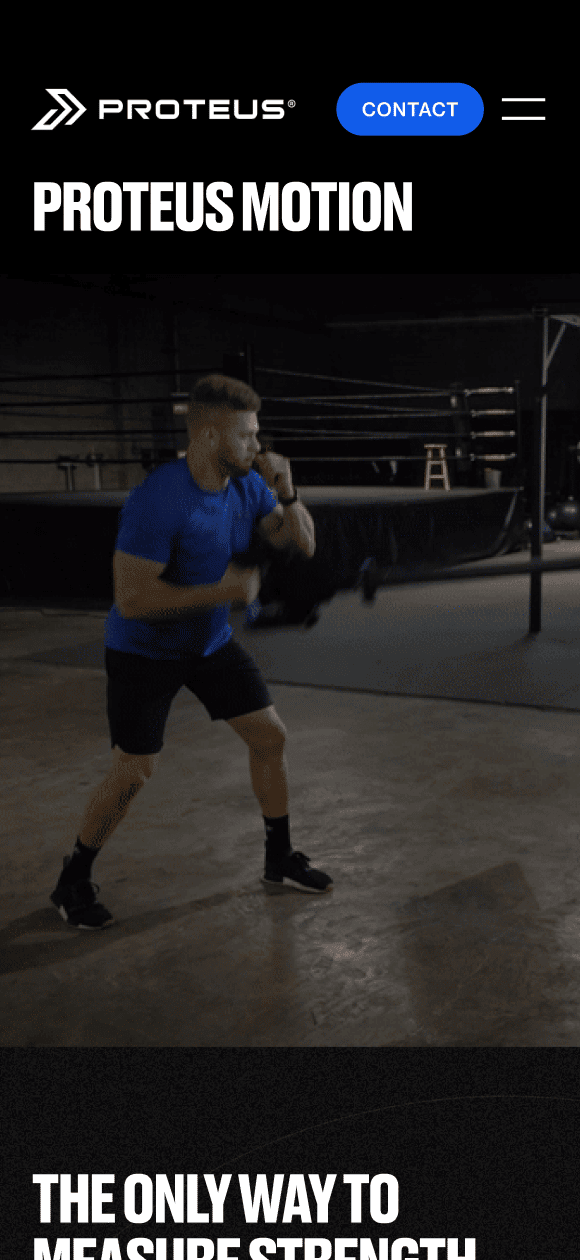
This project was a workout. Literally. Before we got started building a new site for a revolutionary new piece of training equipment, we had to test it! Drew, our Creative Director, went to a local boxing gym in Portland to put the Proteus machine through its paces … or was it the other way around? Regardless, he gained a lot of insight into how to capture the essence of the brand by experiencing this unique product firsthand.
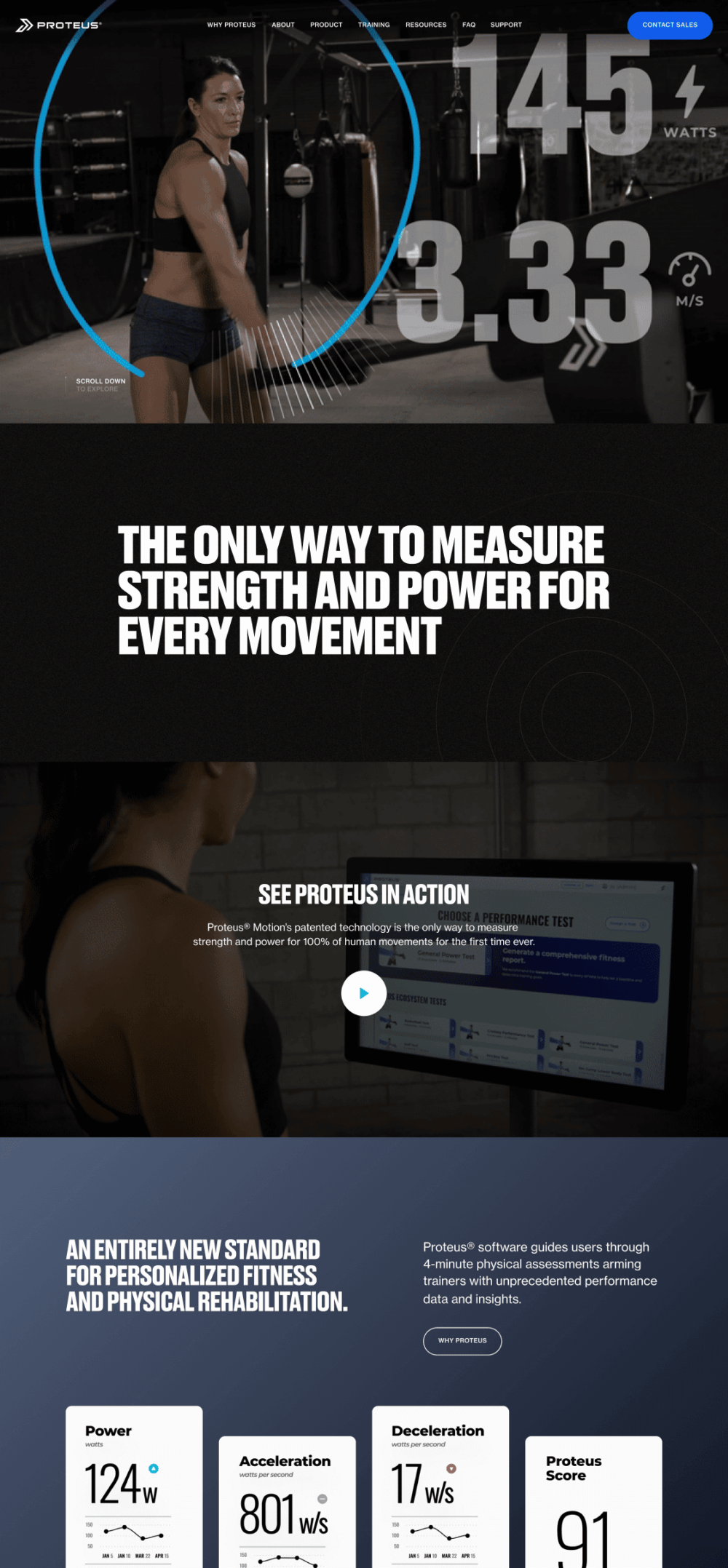
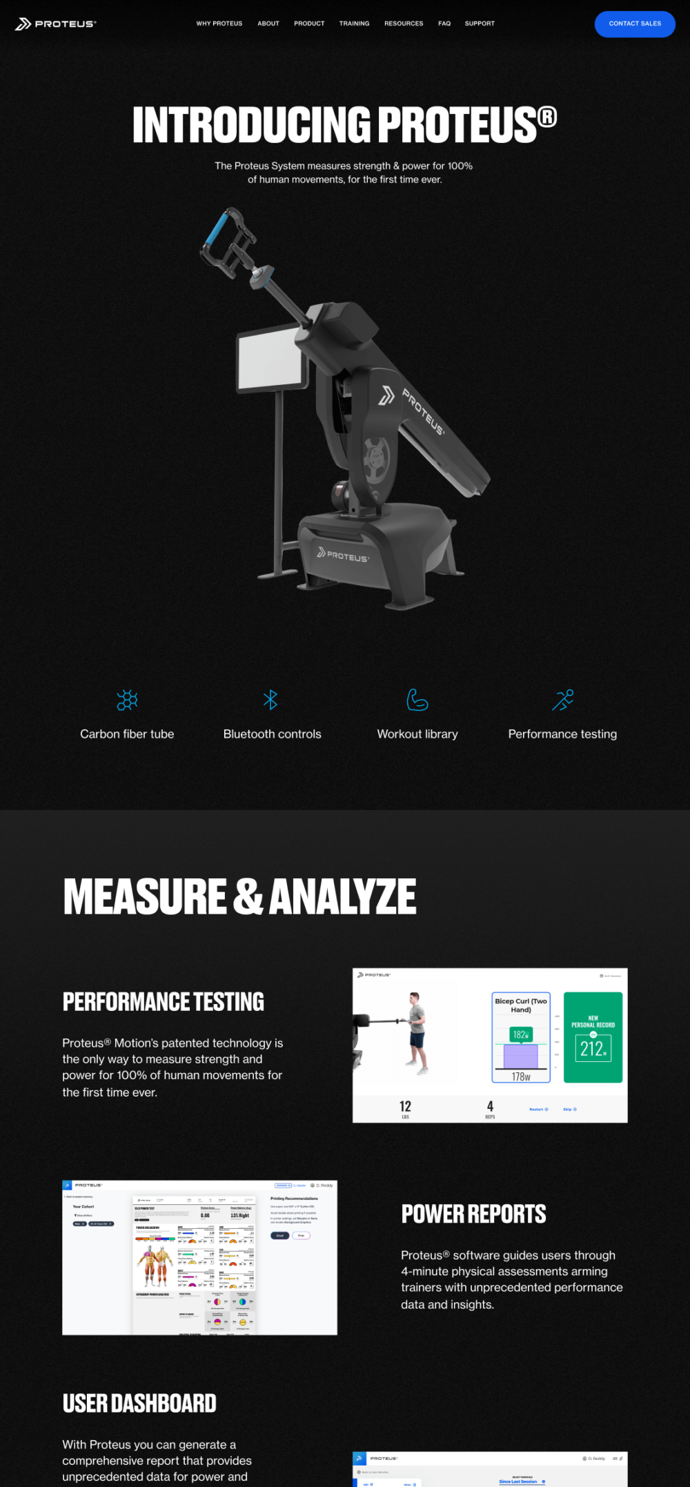
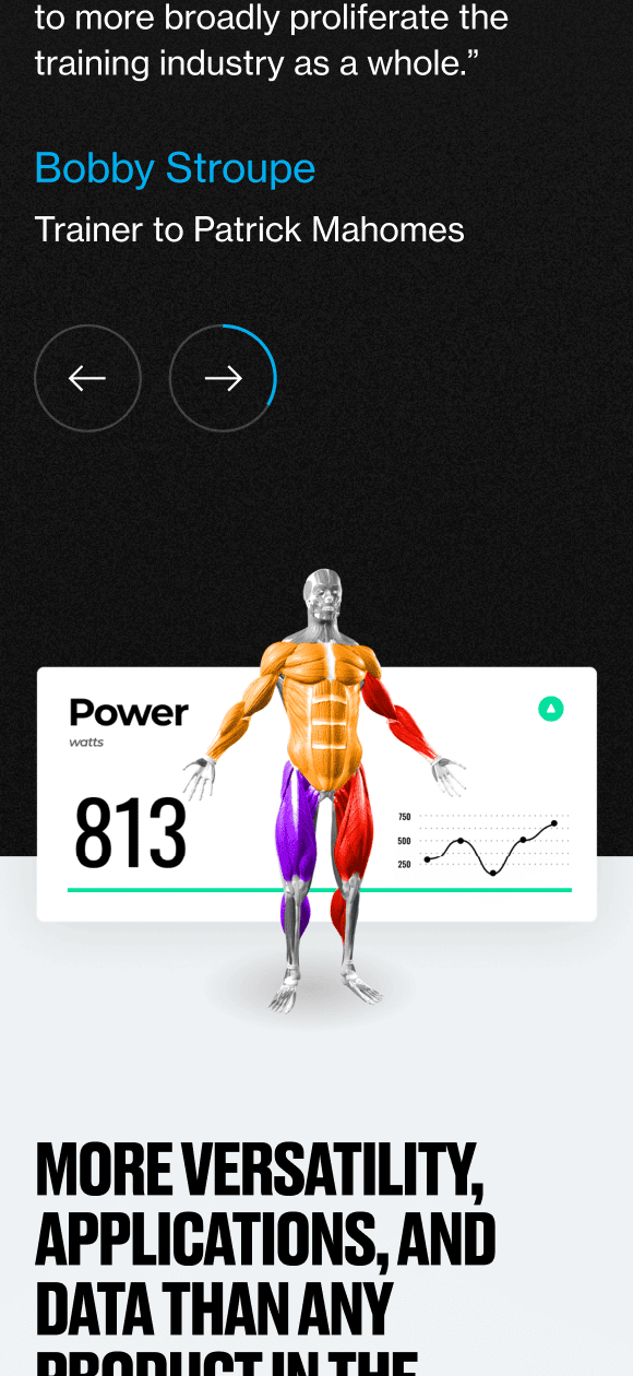
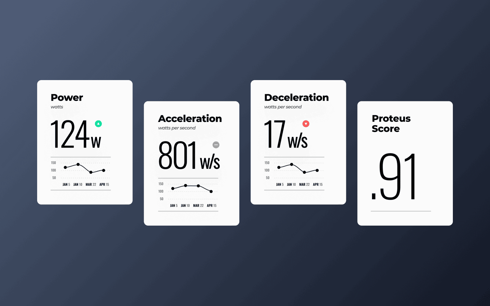
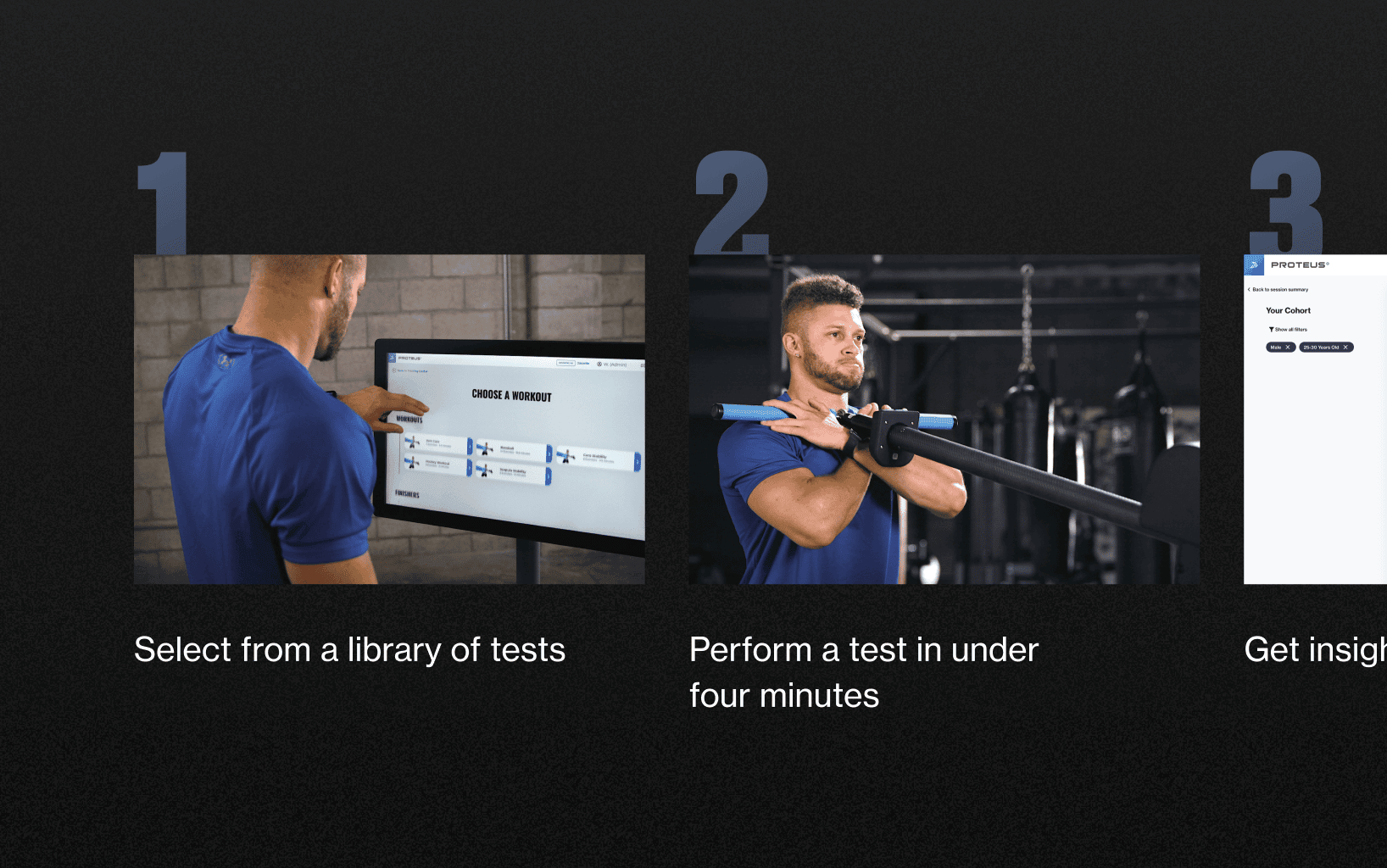
The next best thing to actually using a Proteus machine is seeing it in action. Full screen video with performance overlays lead the experience. Then, as you dive deeper, you can watch individual exercise videos or scientific breakdowns of how the machine analyzes and maximizes athletic performance. We wanted the site to strike a nice balance between being informative and showcasing their well-deserved hype. The ‘Why Proteus’ page gives a compelling pitch in a few scrolls.
What we learned
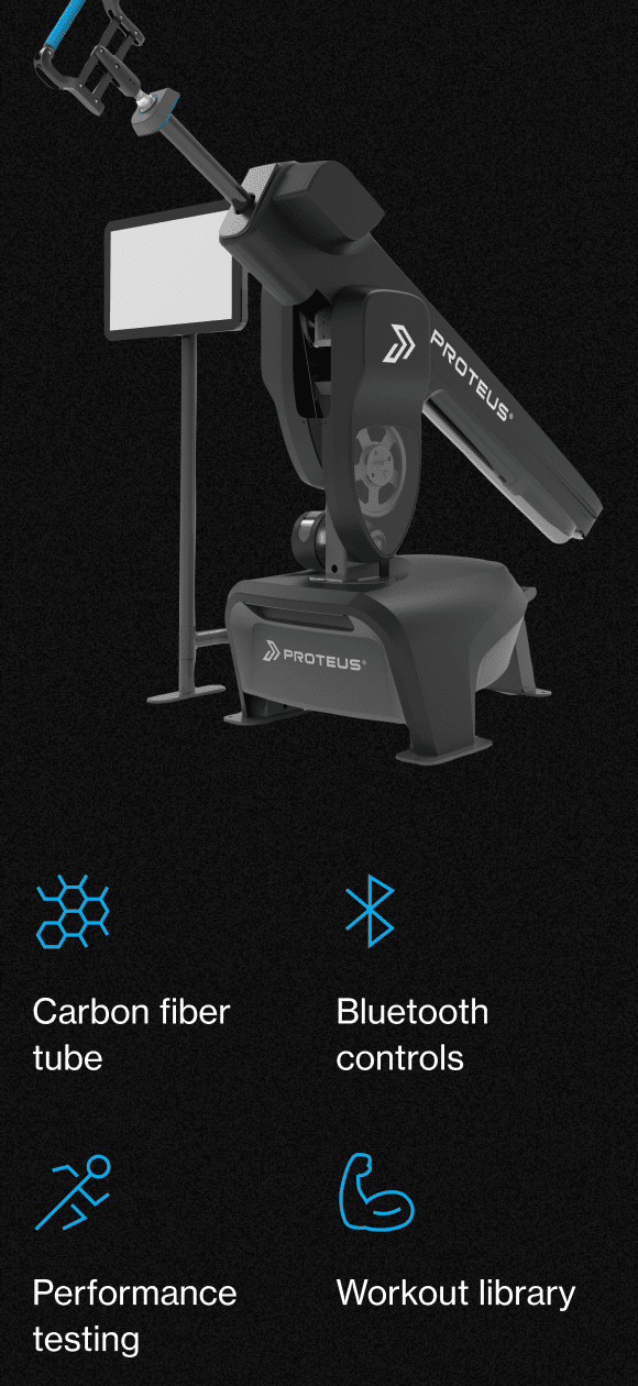
Proteus is not competing with direct-to-consumer products like Peleton. This is a commercial-grade piece of machinery geared at trainers, pro athletes, and performance and rehabilitation centers. We made sure the website would position the company to appeal to people whose livelihoods depend on training—rather than coming off like a lifestyle brand. Bold, direct, and lacking playful flourishes gives the whole experience a powerful feel. Time to train.
