12 Effective and Innovative Features to Create a Great eCommerce Site Experience
An eCommerce site should not only boast of an impressive site design, it should also provide visitors with an excellent shopping experience. The more your site visitors enjoy being on your website, the more time they will spend on it and will make it more likely for them to actually buy something, which after all is the ultimate goal of an eCommerce site.
There are many effective and innovative features that can help eCommerce sites deliver a great user experience. Presented below are 12 of them:
1. Search, Filter & Sort
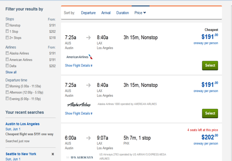
Search, filter and sort are the main features of an eCommerce site to provide a positive shopping experience to its visitors. Helping customers find what they’re looking for is a proven way to generate sales.
Travelocity, a top online travel agency, is a well-designed and usable site which provides excellent user experience by filtering out options and helping users drill down to find what they are looking for in less time.
Flight results are presented in a visual timeline allowing people to select the best flights at a glance. Users can also sort results based on the price, duration, arrival and departure of the flights.
Also, hotel search results are shown on a map so that people can view where in a city they will be staying, along with the nearby landmarks.
2. Product Zoom
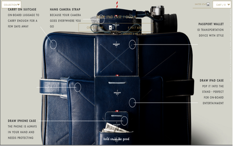
A good zoom feature for product images is always a plus point as it allows visitors to see the products in minute detail.
The website hard graft is a visual treat. Individual product pages on this site combine style with function. Big high-resolution images capture the essence of the attractive product design, thus presenting the product beautifully.
From multiple product images for each product, one of the images encompasses the description of the product. It’s just a great way to put a ton of content into a small space without any visual clutter.
3. Excellent Video

A product may look good online, but how do you convince a customer of its quality based on a few pictures? This is where a good descriptive product video helps. If a picture is worth a thousand words, then a video is worth a million words. Product videos should depict product specifications, features and also describe the it can benefit users.
CamelBak has adopted digital technology in a big way by showing product-based videos on individual product pages. Camelbak directly caters to its target audience, mainly composed of athletes by highlighting the simplicity and convenience of its products in almost every video.
4. Content is King

Research shows that people are more likely to purchase products from websites that produce custom content. Providing your customers with unique content regarding your product, service or industry will make them stick around you.
To generate quality content, a fashion house could talk about celebrities, as they are seen as fashion icons and can related directly to the interests of those striving to keep up with the latest trends who covet their fashion choices.
Jimmy Choo is quite aware of people’s infatuation with celebrities and is thus making excellent use of it through Choo World. It’s a news/content section integrated into the website, which shows pictures of celebrities wearing their shoes and also links back to the relevant product pages.
In addition, it delivers news, trending information, video content, interviews with actors and branded content on fashion. It also provides visitors with advice on fashion. What else could someone ask for?
5. Virtual Try On
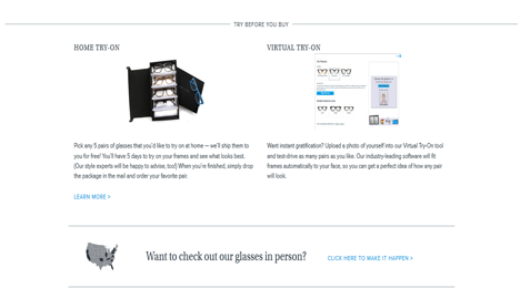
One of the many limitations to shopping online is the inability to try on clothing or accessories. Warby Parker has created the Virtual Try-On program to get around this issue and build a better online shopping experience for its users.
Shoppers can try the eye frames on photos of different models or upload their own photos to virtually wear the glasses. Visitors are allowed to save images of the experience to their computer or share them with their Facebook network.
Warby Parker further raises the user experience bar by offering a tangible, innovative, no risk Home Try-On buying program that allows their online shoppers to order five frames to try at home for five days at free of charge.
6. Product for Rent
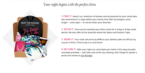
Despite already owning several designer dresses and only because they do not want to be seen in a dress they have already worn before, some fashionistas will spend thousands of dollars on new designer dresses to wear them for an important occasion. In such a case, what can a woman who wants to save bucks as well as be considered fashion forward in her social circles do? Rent The Runway has the answer.
Rent the Runway, a member-only website, offers the inexpensive alternative of renting to women who don’t want to pay the full retail price for a dress they will only wear once or twice, or to those who just want to change their look often.
It has thus transformed the online retail industry by making designer dress and accessory rentals a convenient and accessible experience for millions of women.
7. Comparing Options
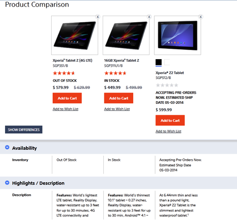
Shoppers are often confused by wide ranges of high quality products put on display side by side. In such cases, it becomes necessary to use feature comparison tools. These tools help people compare the features (including the colors, prices, dimensions, etc.) of different products of the same category and choose the best one for them.
Sony is a well-designed site which provides an excellent user experience. Product comparisons on this site allow visitors to compare products of same category side-by-side, instead of flipping through many pages.
8. Gift Registry
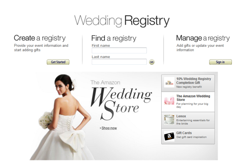
Special occasions like getting married or having a baby require a celebration, and with celebrations come many lovely gifts. Amazon makes it easy for the friends and family of its customers to choose the perfect gifts for them by setting up gift registries or wish lists.
An email with a link to the registry is send to friends and family. The site also offers a ‘Thank You’ list, which keeps the customers updated of the purchases made for them. Universal Registry, one of Amazon’s innovative features, allows customers to add items to their registry from any website.
9. Share on Social Media

A commonly utilized feature on eCommerce sites today is the inclusion of social sharing buttons on product pages. Eventbrite, an online ticketing service, is making excellent use of this feature.
When visitors book tickets to upcoming concerts or conferences using Eventbrite, the website prompts them to share their purchase via Twitter, LinkedIn, or email. Customers can also find out via Facebook which of their friends are attending the said concerts or conferences.
10. A Swift Checkout Process
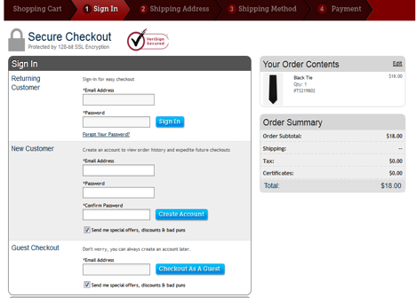
According to a Webcredible survey, lengthy checkout processes make 10% of people abandon their shopping carts. A lengthy checkout process includes multi-page checkouts that keep presenting customers with additional forms, questions or products.
An eCommerce site should desist from asking more questions than absolutely necessary to make the checkout process smoother for their customers.
Ties.com has a very well-designed checkout process. It offers shoppers a guest checkout option so that they do not have to spend time registering with the site. The checkout process only contains a few steps to keep things simple for the shoppers.
11. Product Recommendations
According to an infographic from Monetate, recommendations can increase revenue by up to 300%, conversions by 150%, and boost the average order value by 50%. These stats prove that product recommendation is a great upselling feature for eCommerce sites.
Product recommendations are generally based on user profiles or the users’ search history.
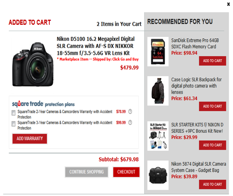
Rakuten.com does a brilliant job by showing visitors which other products they can purchase alongside the ones they are currently viewing under the section ‘Recommended for you’. This encourages visitors to purchase more than one item at once. This site also thus provides related products in an easy-to-locate manner for the buyers.
For instance, if a customer adds a DSLR camera to their cart, the website will show accessories like memory card and a camera system case in the product recommendation section.
12. Product Reviews
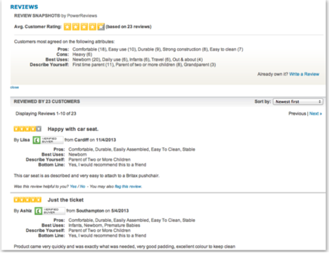
Majority of customers will want to see user reviews before deciding to make a purchase. As per reports, 79% of consumers trust online reviews as much as personal recommendations. Product reviews are thus a ‘must-have’ feature on any eCommerce site today.
Kiddicare provides a great example of how to use customer reviews to aid conversions. Not only does it display reviews and average ratings for its products, it also shows the pros and cons and the best uses of these products.
In addition, it delivers a description of the reviewers themselves, meaning that shoppers can see customers whose profiles match their own, thus reinforcing the relevance of products to their own needs.
Make the shopping experience for your visitors as simple and straightforward as possible by including design elements that are a ‘must use’ for eCommerce sites. Also, you can take a cue from the aforementioned features and come up with innovative ideas for your eCommerce site to increase your sales.
