10 Principles of Good Web Design
Good web design involves more than an aesthetically pleasing appearance.
In fact, a range of professionals with different areas of expertise are engaged in each major decision – when it is done right. We have outlined the 10 basic principles of good web design to address what we consider to be the most critical points in a creating a site that brings in high numbers of conversions.
1. Less is More – Simplicity Rules
Many sites are over-designed, with too many elements on the page, distracting visitors from the purpose of the site. In effective web design, simplicity rules. Not only does a clean, fresh design make the site easier to navigate, but the aesthetics are more appealing and will stand the test of time. It is unnecessary, as well as distracting, to load a site with design features that don’t serve a purpose. What is the purpose of your company website? To direct new business directly into the lap of your enterprise, in volume, keep your design simple so your users can find their way naturally and easily.
2. Innovative but Not Distracting
An impressive design involves creativity and natural talent. Professionals in the design industry understand how to use whitespace. Whitespace, or negative space, is the area of the page that is “empty,” found between graphic elements, images, and text. An innovative use of design elements and whitespace creates a less distracting, more appealing design, and guides visitors where you want them to go. Consider the iconic logos of Apple and Google — unforgettable. Simple, clean design, surrounded by whitespace makes a website more effective. Cheaper, lower quality products often have busy, noisy, ad-oriented designs, and website visitors automatically consider a distracting site to be promoting a lower quality product.
3. Aesthetically Appealing – To the RIGHT Users
You have a specific market segment that is your target customer (or client). The design must be crafted explicitly to appeal to that niche. Research into buyer habits can reveal the type of image, colors, and other design features that are appealing to those you want to reach. Each “buyer persona” has specific likes and dislikes, and research into likes/dislikes are essential. High numbers of site visitors are useless if they are not those who will eventually convert — and buy.
4. Respectful, Honest, and Engaging
Social media has had a significant impact upon communication, both written and spoken. Visitors want to be engaged in a very “human” way. Even the largest multinational corporations have been forced to put a human face on what they do. Every word, phrase, and headline must be respectful of the user, honest, and have some engaging quality that makes it intriguing. As an example, “put your roof to work” would be more likely to get a response than “find a solar installer.” The basic concept is that people want honesty, and appreciate it. Your company may participate in various charity events, or donate time to causes you care about – let them know who you are. Become real.
5. Designed for Usability and Functionality
In website design, usability and functionality must drive each decision – outstripping any other design consideration. To achieve a clear, easy, and ultimately, direct path to conversions, both design and technical issues come into play. Every link must function fast, and every button and call to action must be positioned correctly, demanding as little effort as possible for the visitor to move forward to the next step.
6. Cohesive in Design, Down to the Details
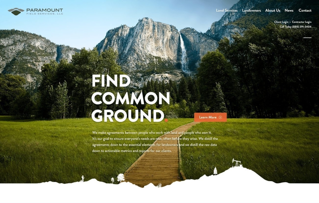
Your enterprise has a unique personality, as an entity. That personality is demonstrated in your service, your history, how you conceive of your mission, and by the actions of every member of your team. Communicating the unique qualities of your business through design involves making every element, down to the details, a reflection of that personality. There are no minor details in a design – every piece must fit together seamlessly, and create a cohesive appearance that serves to support the appeal of your brand.
7. Easily Understood
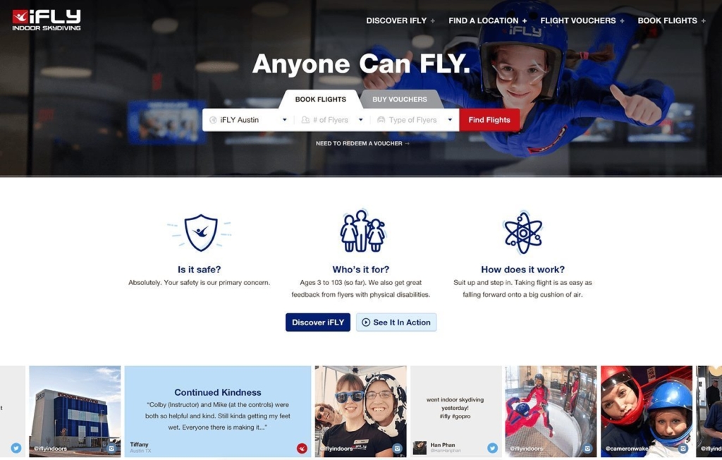
Site visitors must be able to easily understand every word, phrase, and headline without any confusion. One unusual or less commonly used word or phrase will drive them off. Industry-specific terms that are not in common usage will hinder your appeal. Dense, complex content won’t work. Calls to action that are unclear or hard to find will be skipped – and you have one more lost customer. All site content and each visual element must be laid out clearly and cleanly, with all critical conversion points visible above the fold (not requiring scrolling to find). Any deviation merely creates a barrier to conversion.
8. Design Elements Inspire Users to go Deep
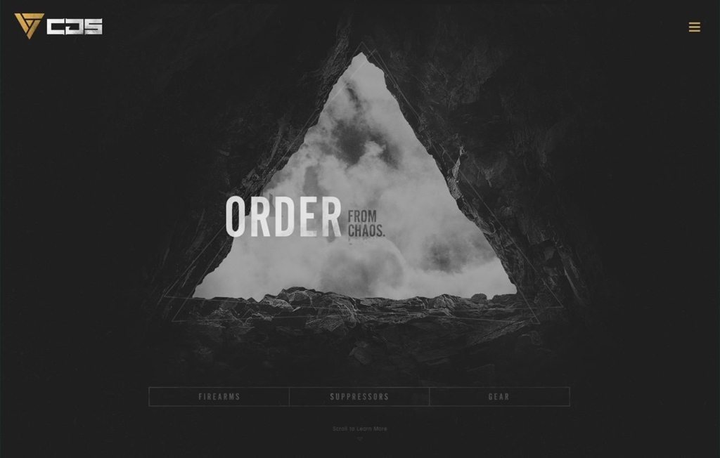
Your homepage must have an initial appeal in design and usability. Every design feature is then developed with the specific purpose to inspire the visitor to find out more – and go deeper into your site, and in the end, convert and become a customer. It takes rare skills to achieve this purpose, as well as experience and insight into user behaviors. Nothing should be left to chance – your design should naturally lead them to where you want them to go.
9. Visual Elements Placed to Focus User Attention
The exact placement of visual elements is a major factor in a successful web design. All design features create an open, inviting path to conversions. Design elements can be explicit, such as arrows, or very subtle. These design elements act as cues that focus visitor attention exactly where it needs to go. Giving the eyes only one design element on which to focus and carefully positioning calls to action are critical factors that must be carefully planned and executed to result in high numbers of conversions.
10. Emphasis on What Matters Most
What matters most to your website visitors? The essence of your presentation must clearly communicate that your business is the place to solve a specific problem or need. The balance between images and copy are just one part of this process. To appeal to the target audience, emphasis must be placed upon what your customer wants most. For results, it is necessary to research what your customers, as a group, are looking for, and the questions they are asking. Once these needs and wants are identified, you work with these concepts to create a presentation that emphasizes these with color, design, and text.
Glide Design in Austin, TX: Custom Website Design
Glide Design is a Web Design Agency from Austin, Texas, our team focuses on building websites that work. They are clean and goal-driven, plus our hard work makes them adored by search engines. Call us or reach out to us online – we can bring your online presence to life.
